Brand kit
Logo, colors, and guidelines.
Everything you need to write about the work, list an event, or put the mark on a poster. Ink and paper, a signature, and two typefaces. The color lives in the sculptures.
Download the full kit (ZIP)01Logo
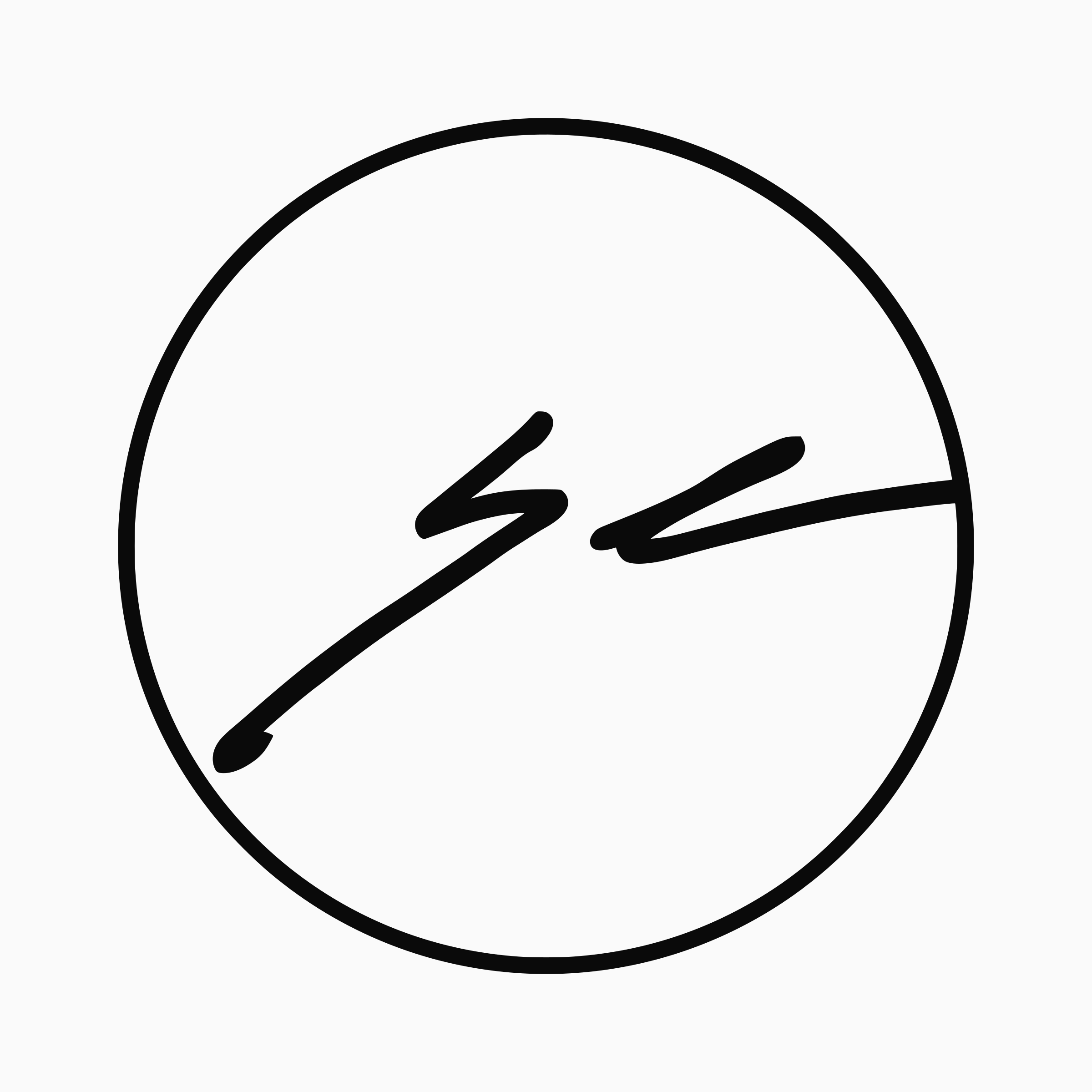
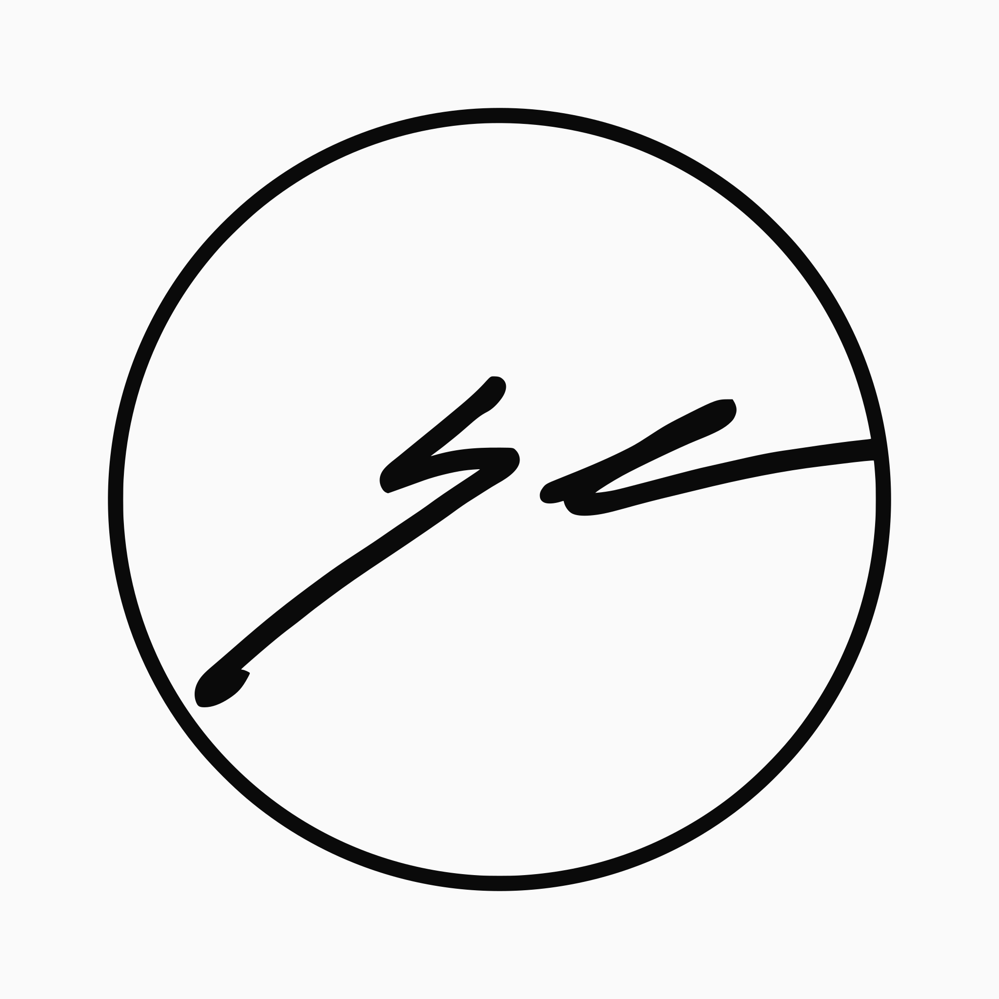
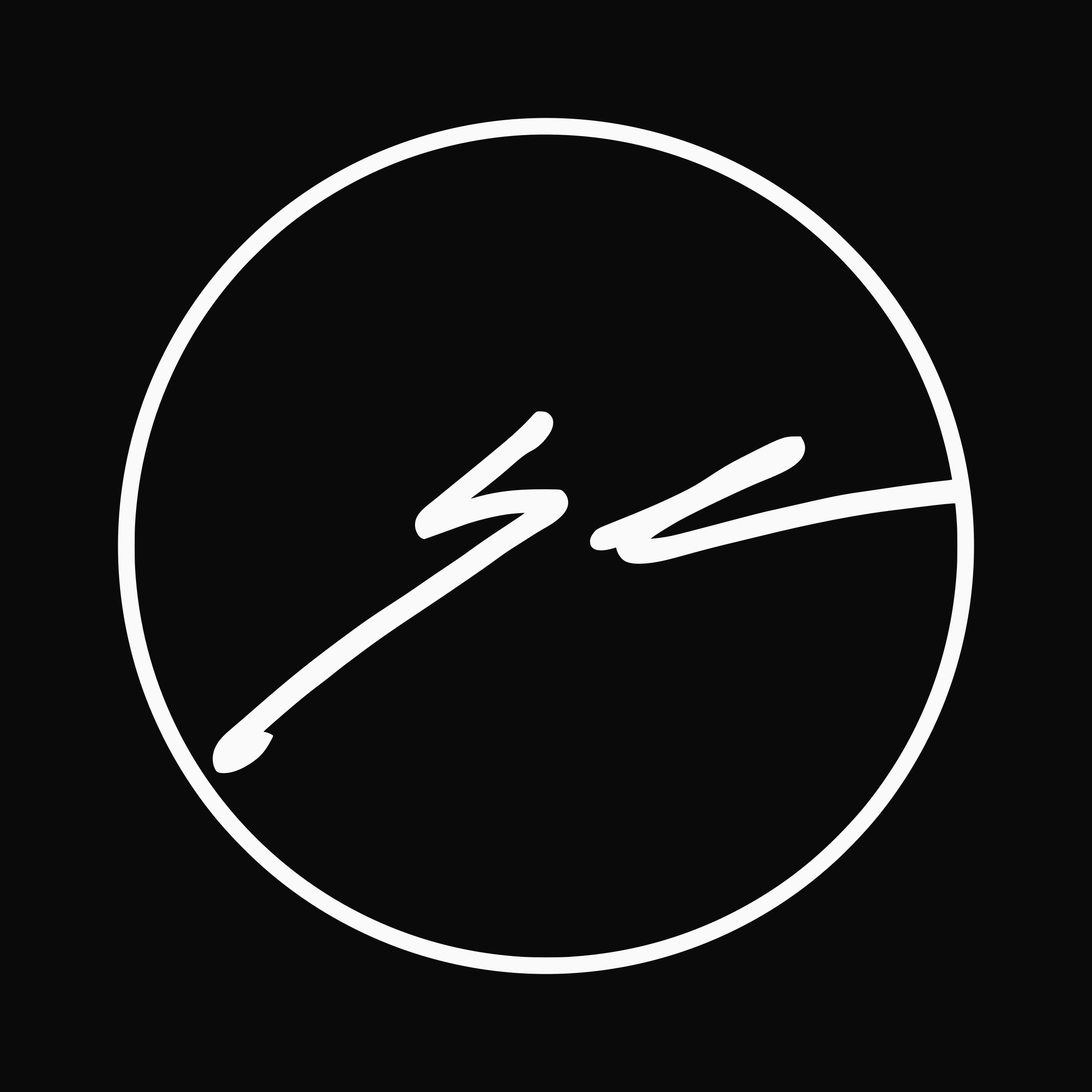
The mark is Shawn's initials, signed by hand and closed in a circle. The last stroke runs past the edge and touches the ring. That signature goes on every finished piece, so the logo is the same mark you find on the work itself.






Do
- Leave clear space around the mark of at least a quarter of its width.
- Use the reversed mark on dark backgrounds and photographs.
- Keep it at 24px or larger on screen and 0.5in or larger in print.
- Pair it with the name set in Instrument Serif when the mark needs words.
Don't
- Recolor it. The mark is Ink or Paper, nothing else.
- Stretch, rotate, outline, or add effects.
- Redraw or retype the signature.
- Place it over busy artwork where the strokes lose contrast.
 Shawn Kemp Art
The name in Instrument Serif beside the mark. Set it as live text; there is no separate wordmark file.
02Color
Two colors. Ink and paper, like a drawing before it's cut. The sculptures carry all the color, so everything around them stays quiet. Click a swatch to copy its hex.
Reserved
The only hue on the site, and it marks the creator's discount and nothing else. Using it for anything else takes away the one thing that makes the discount easy to spot. Don't use it in partner materials.
03Typography
Display
Instrument Serif
The math is the seed. The hands are the work.
Headings, piece titles, and the name. Regular 400 only, set tight.
Google FontsText
Inter
One-of-a-kind paper sculptures, designed and hand-assembled in Bellingham, WA.
Body copy, captions, buttons, and prices. Regular 400 and Medium 500.
Google FontsBoth are free under the SIL Open Font License. For the web:
<link href="https://fonts.googleapis.com/css2?family=Instrument+Serif&family=Inter:wght@400;500&display=swap" rel="stylesheet">04Voice
Shawn Kemp makes one-of-a-kind laser-cut layered paper wall sculptures from generative mathematics in Bellingham, WA. Code chooses from endless compositions. Shawn keeps one, cuts it, and builds it by hand, layer by layer. Each piece is made exactly once.
We are
- Handmade, not mass-produced
- Slow, not drop-driven
- Personal, not transactional
- Plainspoken, not art-speak
- Rooted in Bellingham, not placeless
In copy
- Write in first person when it's Shawn talking. Short sentences.
- Say what it is: paper, layers, glue, light, shadow.
- Say “original,” “piece,” and “paper sculpture.” Never “print,” “limited edition,” or “drop.”
- No em dashes. Use a period or a comma.
Questions about using the mark, or need high-resolution photos of the work? Email hello@shawnkemp.art.